Trade
Basic
Futures
Futures
Hundreds of contracts settled in USDT or BTC
Options
HOT
Trade European-style vanilla options
Unified Account
Maximize your capital efficiency
Demo Trading
Futures Kickoff
Get prepared for your futures trading
Futures Events
Participate in events to win generous rewards
Demo Trading
Use virtual funds to experience risk-free trading
Earn
Launch
CandyDrop
Collect candies to earn airdrops
Launchpool
Quick staking, earn potential new tokens
HODLer Airdrop
Hold GT and get massive airdrops for free
Launchpad
Be early to the next big token project
Alpha Points
NEW
Trade on-chain assets and enjoy airdrop rewards!
Futures Points
NEW
Earn futures points and claim airdrop rewards
Investment
Simple Earn
Earn interests with idle tokens
Auto-Invest
Auto-invest on a regular basis
Dual Investment
Buy low and sell high to take profits from price fluctuations
Soft Staking
Earn rewards with flexible staking
Crypto Loan
0 Fees
Pledge one crypto to borrow another
Lending Center
One-stop lending hub
VIP Wealth Hub
Customized wealth management empowers your assets growth
Private Wealth Management
Customized asset management to grow your digital assets
Quant Fund
Top asset management team helps you profit without hassle
Staking
Stake cryptos to earn in PoS products
Smart Leverage
NEW
No forced liquidation before maturity, worry-free leveraged gains
GUSD Minting
Use USDT/USDC to mint GUSD for treasury-level yields
More
比特校涨
ETH Operation Strategy
Buy at 3190. Stop loss at 3160. Take profit at 3240 to 3280.
Short at 3330. Stop loss at 3355. Take profit at 3261.
BTC Operation Strategy
Buy at 93300. Stop loss at 92800. Take profit at 94600.
Short at 96000. Take profit at 94800. Stop loss at 96800.
View OriginalBuy at 3190. Stop loss at 3160. Take profit at 3240 to 3280.
Short at 3330. Stop loss at 3355. Take profit at 3261.
BTC Operation Strategy
Buy at 93300. Stop loss at 92800. Take profit at 94600.
Short at 96000. Take profit at 94800. Stop loss at 96800.


- Reward
- like
- Comment
- Repost
- Share
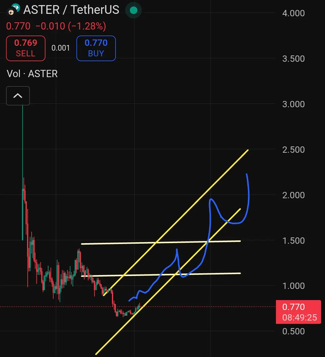
$TREE 1D 🕯 - #TREE is now bouncing off a major support level, and is about to retest a daily trendline, so stay tuned, let's see what happens. 📈 #Gate2025AnnualReport #CryptoMarketRebound
TREE2,63%
- Reward
- 1
- Comment
- Repost
- Share
The current trend is very clear; a pullback to buy more steadily!
Highest level 93,750/3,183
Zhiying at 93,600/3,180
This kind of market sentiment is as easy as breathing to make profits~
View OriginalHighest level 93,750/3,183
Zhiying at 93,600/3,180
This kind of market sentiment is as easy as breathing to make profits~
- Reward
- like
- Comment
- Repost
- Share
Every time I have no money, it's always ZhiMa secretly airdropping to me.
View Original
- Reward
- 5
- 7
- Repost
- Share
TenDayKing :
:
2026 Go Go Go 👊View More
- Reward
- like
- Comment
- Repost
- Share
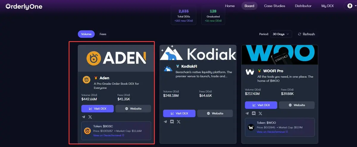
Now that perp is booming, more and more project teams are starting to develop perp platforms. @bugscoin_bgsc
The first phase launched is the "Genesis" season.
This phase is aimed at early participants in ADEN perpetual contracts. Points will be calculated and settled over fixed periods. Currently, it seems that 10,000 USDT trading volume equals one point.
@bugscoin_bgsc is a perp platform backed by @Gate. According to CoinMarketCap data, it ranks 3rd among decentralized perpetual contract exchanges worldwide, with a monthly trading volume exceeding $20 billion and over 200,000 users globally.
BGSC-2,52%
- Reward
- like
- Comment
- Repost
- Share
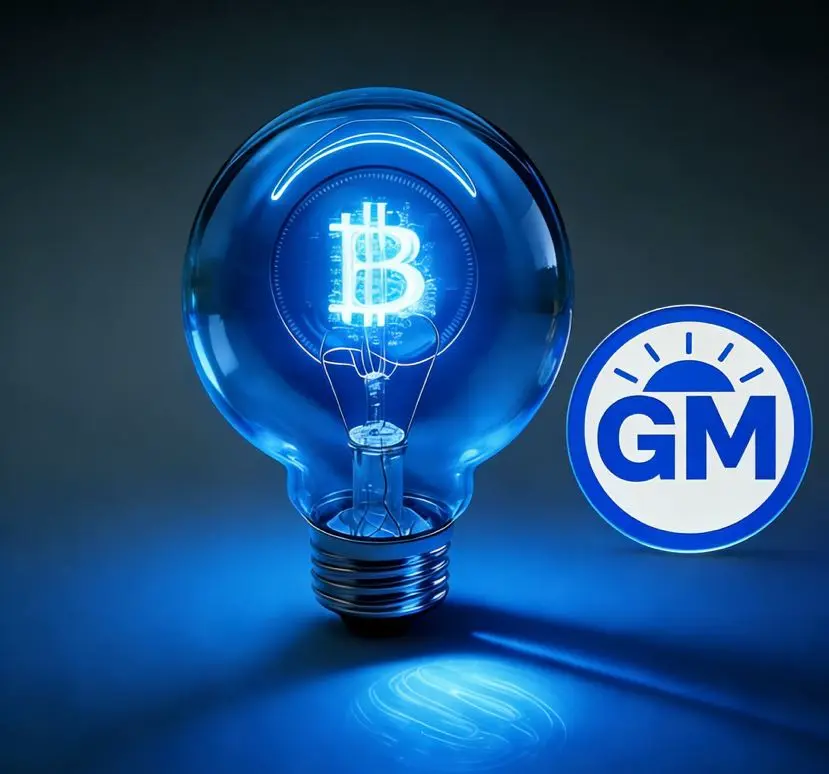
🟡 Understanding GM
GM is not just cryptocurrency,
It is the most widely recognized language of consensus in the Web3 world.
Saying "GM" every day is a greeting, a sense of presence, and a community ritual in the on-chain world.
We have transformed this phrase, spoken by countless people, into a circulating value—
Making GM no longer just a spiritual symbol, but a true asset belonging to everyone;
Not just participation, but a form of ownership.
📌 The birth of $GM comes from three core beliefs:
🔸 Making consensus quantifiable: every greeting is not just a sound, but a transfer of value
🔸 Br
View OriginalGM is not just cryptocurrency,
It is the most widely recognized language of consensus in the Web3 world.
Saying "GM" every day is a greeting, a sense of presence, and a community ritual in the on-chain world.
We have transformed this phrase, spoken by countless people, into a circulating value—
Making GM no longer just a spiritual symbol, but a true asset belonging to everyone;
Not just participation, but a form of ownership.
📌 The birth of $GM comes from three core beliefs:
🔸 Making consensus quantifiable: every greeting is not just a sound, but a transfer of value
🔸 Br
- Reward
- 4
- 8
- Repost
- Share
ShiFangXiCai7268:
Hold on tight, we're about to take off🛫View More
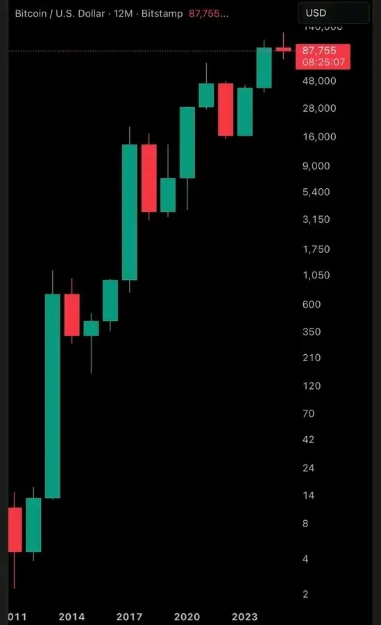
This is a yearly chart of Bitcoin. Each candlestick represents the price of Bitcoin in a particular year. As you observe, on average, Bitcoin tends to have three consecutive years of upward movement (green), followed by one year of decline (red).
However, this time, the two-year increase was driven by significant institutional adoption, especially in 2025, which should have been green, indicating upward movement, but it only declined slightly. Still, if you lived through the year yourself, you would realize that Bitcoin didn't just go straight down; it moves up and down. In fact, even until Au
However, this time, the two-year increase was driven by significant institutional adoption, especially in 2025, which should have been green, indicating upward movement, but it only declined slightly. Still, if you lived through the year yourself, you would realize that Bitcoin didn't just go straight down; it moves up and down. In fact, even until Au
BTC-1,2%
- Reward
- like
- Comment
- Repost
- Share
#Gate 2025 Year-End Community Gala#
Top Streamers & Content Creators Year-End Awards
Who will be the Top Streamers of the Year? Who will claim the top spot on the Content Creator leaderboard? Join me in voting to support your favorite streamers and creators, and witness the rise of community stars!
https://www.gate.com/activities/community-vote-2025?ref=VVNHBAXDBQ&refType=1&refUid=35892773&ref_type=165&utm_cmp=xjdtmcgP

- Reward
- 10
- 18
- Repost
- Share
EagleEye :
:
Excellent post! Very motivating and inspiringView More


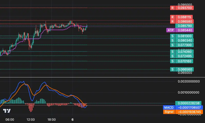
📊 COLLECT/USDT 15m Technical Overview
💰 Current Price: 0.08579 ( Trend initiation +3.17%)
📈 Trend: **Suspected trend reversal** | 6 K-lines in operation
🎯 Tracking line: 0.08544 ( Dynamic support/stop-loss reference )
Key levels:
Support 0.08130 / 0.08034
Resistance 0.08658 / 0.08811
Strategy: The price has rebounded above the dynamic stop-loss line, and the bearish trend faces a severe test. If it stabilizes above 0.08544, it may challenge the resistance at 0.08658.
Risk: The price is still below the key resistance. If it cannot break through effectively, the bearish trend may continue.
View Original
- Reward
- 1
- Comment
- Repost
- Share

- Reward
- 1
- Comment
- Repost
- Share
- Reward
- like
- Comment
- Repost
- Share
$fil This steady and solid approach presents a great opportunity
Come to Gate to check out the market
Come to Gate to check out the market
FIL-1,25%
- Reward
- 9
- 1
- Repost
- Share
BitcoinCultureGm :
:
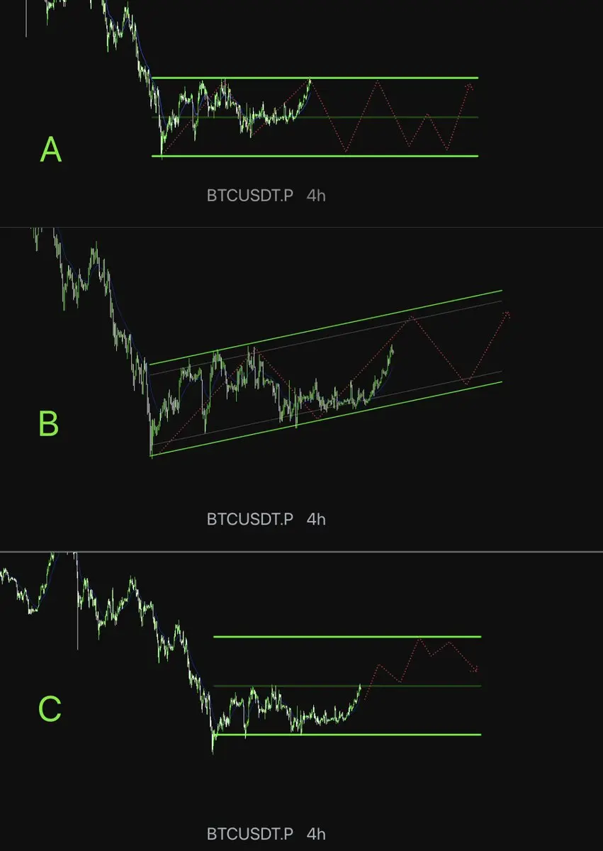
Happy New Year, big profits, and plenty of time for other hobbies. Don't forget about NFTs, especially the Bitcoin Emblems collection on our Gate_NFT exchange. Buy at least one. $BTC 's 3 hypotheses, please make your choice! 👋
A: 82K-94K continues to fluctuate significantly
B: Breakout of the large fluctuation channel (major bear flag) above 94K to 98K, then retrace to 89K
C: Direct breakout above 94K, forming a short-term trend, and directly reaching above 100K
A: 82K-94K continues to fluctuate significantly
B: Breakout of the large fluctuation channel (major bear flag) above 94K to 98K, then retrace to 89K
C: Direct breakout above 94K, forming a short-term trend, and directly reaching above 100K
BTC-1,2%
- Reward
- like
- Comment
- Repost
- Share
Stop "evil cultivation" now! The crash has happened
I saw several accounts in the English community had their creator earnings suspended. After appealing, they were directly permanently disqualified.
It's so tragic. Replying too quickly, too frequently, only interacting with a fixed few accounts—these can all be recognized by Grok as abnormal patterns, directly affecting revenue sharing, or even limiting traffic or banning accounts.
Accounts that do not meet X's creator monetization standards violate the quality/spam policies.
Has anyone experienced a suspension recently? Share your experience
View OriginalI saw several accounts in the English community had their creator earnings suspended. After appealing, they were directly permanently disqualified.
It's so tragic. Replying too quickly, too frequently, only interacting with a fixed few accounts—these can all be recognized by Grok as abnormal patterns, directly affecting revenue sharing, or even limiting traffic or banning accounts.
Accounts that do not meet X's creator monetization standards violate the quality/spam policies.
Has anyone experienced a suspension recently? Share your experience

- Reward
- like
- Comment
- Repost
- Share
- Reward
- like
- Comment
- Repost
- Share
#DOGE
🔥 DOGE Price Forecast
🐕 First, look at the market signals
The 20-day moving average at $0.13 has already started to turn upward, and RSI has returned to the positive zone. What does this indicate?
👉 Buyers are gaining control
👉 Market sentiment is clearly warming up
🚀 How does the upside look?
There is indeed some resistance around $0.156, but the strength is not significant. It’s most likely just a “slowdown zone.”
Once a smooth breakthrough occurs, DOGE is likely to continue its upward push, with the target directly at the 200-day moving average of $0.19, which is the position th
DOGE-2,71%
- Reward
- 1
- 1
- Repost
- Share
BlindCryptoMama:
I have a feeling it will go downLooking back on a year in the crypto world—following the market movements up and taking bold steps. Every moment is meaningful. View the Gate Year-End Summary #2025 now, recap your 2025 crypto adventure with Gate, and earn 20 USDT by sharing it. https://www.gate.com/id/competition/your-year-in-review-2025?ref=VVLAULANUW&ref_type=126&shareUid=U1NGVl9cBAsO0O0O
View Original
- Reward
- 1
- Comment
- Repost
- Share
Load More
Join 40M users in our growing community
⚡️ Join 40M users in the crypto craze discussion
💬 Engage with your favorite top creators
👍 See what interests you
Trending Topics
View More20.97K Popularity
9.99K Popularity
7K Popularity
3.99K Popularity
90.21K Popularity
Hot Gate Fun
View More- MC:$3.64KHolders:10.00%
- MC:$3.63KHolders:10.00%
- MC:$3.94KHolders:21.33%
- MC:$3.65KHolders:10.00%
- MC:$3.72KHolders:30.11%
News
View MoreData: The current Crypto Fear & Greed Index is 41, indicating a state of fear.
2 m
Polymarket denies "invasion of Venezuela" settlement results causing user dissatisfaction
28 m
Polymarket denies Venezuela was invaded, sparking strong community dissatisfaction
30 m
opBNB mainnet completes Fourier hard fork, block time shortened to 250 milliseconds
31 m
Data: If BTC breaks through $97,399, the total liquidation strength of mainstream CEX short positions will reach $1.922 billion.
32 m
Pin