# Ultimate Guide to Understanding Popular Candlestick Patterns
Master candlestick analysis to elevate your trading on Gate. This comprehensive guide decodes essential candlestick patterns—from bullish hammers and three white soldiers to bearish shooting stars and dark cloud covers—enabling traders to identify trend reversals and continuations. Learn how to read candlestick charts, recognize bullish and bearish signals, and combine multiple patterns with technical indicators like RSI and MACD for stronger trade confirmation. Discover proven strategies for multi-timeframe analysis, risk management, and pattern implementation that work for both beginners and experienced traders seeking reliable technical analysis tools on Gate.
How to Read the Most Popular Candlestick Patterns
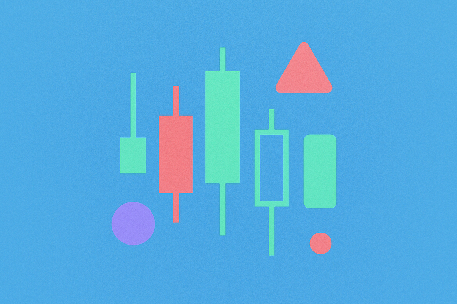
What is a Candlestick?
Candlestick charts represent a fundamental charting technique used in technical analysis to visualize price movements of an asset over a specified time period. These charting tools were first developed in 18th-century Japan and have been utilized for centuries to identify patterns that provide insights into asset price movements. Today, traders and financial analysts widely employ candlestick charts to analyze historical price data and forecast future price movements.
Understanding what candlestick patterns mean is essential for anyone engaged in technical analysis. The power of candlestick analysis lies in pattern recognition. When multiple candlesticks are arranged sequentially, they often form distinct patterns that can indicate whether market prices are likely to rise, fall, or remain unchanged. These patterns serve as visual indicators of market sentiment and can reveal potential trading opportunities. Understanding these patterns is essential for traders seeking to make informed decisions based on technical analysis.
How Do Candlestick Charts Work?
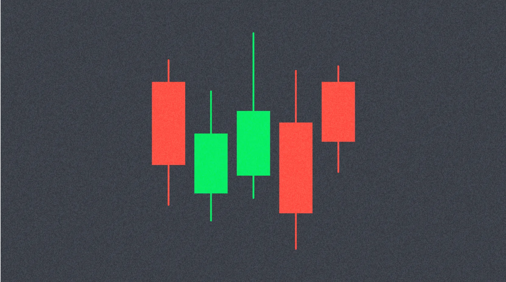
Imagine tracking the price of an asset—such as a stock or digital currency—over a specific time period, whether it be a week, day, or hour. A candlestick chart provides a visual representation of this price data through a distinctive graphical format.
Each candlestick consists of two primary components: a body and two lines, commonly referred to as wicks or shadows. The candlestick body represents the range between the opening and closing prices during the given period. The wicks or shadows extend above and below the body, representing the highest and lowest prices reached during that same period.
Color coding is crucial for interpretation: a green body indicates that the price increased during the period, demonstrating bullish sentiment. Conversely, a red body represents a bearish candlestick, signifying that the price declined during that period. This visual distinction allows traders to quickly assess market direction and momentum at a glance.
How to Read Candlestick Patterns
Candlestick patterns are formed by arranging multiple candles in specific sequences, each with unique interpretations and implications. Some patterns reveal information about the balance between buyers and sellers in the market, while others indicate potential reversals, continuations, or periods of indecision.
It is important to understand that candlestick patterns are not inherently buy or sell signals in themselves. Rather, they serve as tools for analyzing current price action to identify potential future opportunities. Each pattern should be evaluated within its broader market context, considering the surrounding price action and market conditions.
To minimize the risk of losses, many traders employ candlestick patterns in conjunction with other analytical methods. It is common practice to incorporate technical analysis indicators such as moving averages, RSI, and MACD alongside candlestick pattern analysis.
Candlestick patterns can also be effectively combined with support and resistance levels. In trading, support levels represent price points where buying pressure is expected to exceed selling pressure, while resistance levels are price points where selling pressure is anticipated to dominate. Using these levels in conjunction with candlestick patterns can enhance the reliability of trading signals.
Candlestick Patterns for a Bull Market
The Hammer
A hammer is a candlestick characterized by a long lower wick at the bottom of a downtrend, where this lower wick extends at least twice the size of the body. The hammer demonstrates that despite significant selling pressure, buyers have successfully pushed the price back to the opening level. A hammer can appear in either red or green color, with a green hammer potentially indicating a stronger bullish reaction. This pattern suggests that the downtrend may be losing momentum and a reversal could be imminent.
The Inverted Hammer
This pattern mirrors the hammer structure but features a long wick above the body rather than below. Similar to the hammer, the upper wick should be at least twice the size of the body. The inverted hammer typically occurs at the bottom of a downtrend and may indicate a potential uptrend development. The upper wick suggests that the price has halted its downward movement, though sellers ultimately succeeded in pushing it back near the opening price, creating the inverted hammer's characteristic shape. This pattern can signal that selling pressure is weakening and buyers may soon gain market control.
Three White Soldiers
The three white soldiers pattern consists of three consecutive green candlesticks that each open within the body of the previous candlestick and close above the high of the previous candlestick. These candlesticks typically feature small or absent lower wicks, indicating that buyers are stronger than sellers, which drives prices higher. Some traders also consider the size of the candlestick bodies and the length of their wicks when evaluating this pattern. The pattern tends to be more reliable when the candlestick bodies are larger, as this indicates stronger buying pressure and greater conviction behind the upward movement.
Bullish Harami
A bullish harami consists of a long red candlestick followed by a smaller green candlestick that is entirely contained within the body of the preceding candlestick. This bullish harami can form over two or more days and represents a pattern indicating that the rate of selling is slowing and may be approaching an end. This consolidation pattern suggests a potential shift in market dynamics and can precede a reversal of the downtrend.
Candlestick Patterns for a Bear Market
The Hanging Man
The hanging man serves as the bearish counterpart to the hammer pattern. It typically forms at the end of an uptrend with a small body and a long lower wick. This lower wick indicates that significant selling occurred following the uptrend, though bulls managed to regain control and drive the price back up temporarily. This creates a point of uncertainty where buyers attempt to maintain the uptrend while increasing numbers of sellers enter the market. When appearing after a long uptrend, the hanging man can function as a warning that bulls may soon lose momentum, potentially signaling a reversal to the downside.
The Shooting Star
The shooting star is characterized by a candlestick with a long upper wick, little or no lower wick, and a small body, ideally positioned near the bottom. While the shooting star resembles the inverted hammer in appearance, it forms at the end of an uptrend. This pattern indicates that the market reached a local peak but sellers then took control and drove the price down. While some traders prefer to sell or open short positions when a shooting star forms, others prefer to wait for the next candlestick to confirm the pattern before taking action.
Three Black Crows
The three black crows pattern comprises three consecutive red candlesticks that open within the body of the previous candle and close below the low of the last candle. This represents the bearish counterpart to the three white soldiers pattern. Ideally, these candlesticks should not feature long upper wicks, indicating continuous selling pressure driving prices lower. The size of the candlesticks and the length of their wicks can be used to assess the likelihood of trend continuation.
Bearish Harami
Bearish harami consists of a long green candlestick followed by a small red candlestick with a body completely enclosed within the body of the preceding candlestick. The bearish harami can unfold over two or more periods and typically appears at the end of an uptrend, potentially indicating a reversal as buyers lose momentum. This pattern suggests a loss of buying conviction and may precede a downtrend.
Dark Cloud Cover
The dark cloud cover pattern consists of a red candlestick that opens above the close of a prior green candlestick but then closes below the midpoint of that candlestick. This pattern tends to be more significant when accompanied by high trading volume, indicating that momentum may be shifting from bullish to bearish. Some traders prefer to await a third red line to confirm the pattern before taking trading action.
Three Continuation Candlestick Patterns
Rising Three Methods
The rising three methods pattern occurs within an uptrend, where three consecutive red candlesticks with small bodies are followed by a continuation of the uptrend. Ideally, these red candles should not exceed the range of the previous candlestick. The continuation is confirmed with a green candle featuring a large body, indicating that bulls have returned and regained control of the trend's direction. This pattern demonstrates temporary weakness before the primary uptrend resumes.
Falling Three Methods
The falling three methods pattern represents the inverse of the rising three methods. This pattern indicates a continuation of a downtrend, where small-bodied candles form a temporary consolidation before the downtrend resumes. The pattern demonstrates a pause in selling pressure before bears reassert control, confirmed by a subsequent large bearish candlestick continuing the downtrend.
Doji Candlestick Pattern
A doji forms when the opening and closing prices are identical or extremely similar. Although the price may fluctuate above and below the opening level during the period, it ultimately closes at or near the opening price. This unique formation indicates an indecision point between buying and selling forces. The interpretation of a doji, however, heavily depends on its context within the broader market picture.
Based on where the opening and closing lines fall, a doji can be classified as a gravestone doji, long-legged doji, or dragonfly doji. A gravestone doji features a long upper wick with the opening and closing near the bottom, representing a bearish reversal signal. A long-legged doji displays both upper and lower wicks with opening and closing near the midpoint, signaling indecision. A dragonfly doji has a long lower wick with opening and closing near the top, which can be either bullish or bearish depending on context. It is worth noting that while traditional doji definitions require identical opening and closing prices, in volatile digital asset markets, the term is often applied to spinning tops—candlesticks where opening and closing prices are merely very close to one another.
Candlestick Patterns Based on Price Gaps
A price gap occurs when a financial asset opens above or below its previous closing price, creating a visible space between consecutive candlesticks. While many candlestick patterns include price gaps as components, patterns based primarily on gaps are less commonly utilized in digital asset markets. This is because certain markets operate continuously 24/7, unlike traditional stock markets with defined trading hours.
Price gaps can still occur in illiquid markets, though they are not useful as reliable trading patterns. Gaps in such markets primarily indicate low liquidity and wide spreads between bid and ask prices rather than significant price movements or market reversals.
How to Use Candlestick Patterns in Trading
Traders should keep the following principles in mind when implementing candlestick patterns in their trading strategies:
Understanding the Fundamentals
Traders must develop a solid understanding of candlestick pattern fundamentals before using them to make trading decisions. This includes learning how to read candlestick charts and understanding the various patterns that can form. Traders should not take unnecessary risks by trading patterns they do not fully comprehend. A strong foundational knowledge reduces the likelihood of misinterpreting signals and making costly mistakes.
Combining Multiple Indicators
While candlestick patterns provide valuable insights, they should be used alongside other technical indicators to form more comprehensive market forecasts. Examples of indicators that work well in combination with candlestick patterns include moving averages, the Relative Strength Index (RSI), and the MACD (Moving Average Convergence Divergence). This multi-indicator approach increases the probability of accurate signal confirmation and enhances overall trading reliability.
Using Multiple Time Frames
Traders should analyze candlestick patterns across multiple time frames to gain a broader understanding of market sentiment. If analyzing a daily chart, traders should also examine hourly and 15-minute charts to observe how patterns manifest across different time periods. This multi-timeframe analysis helps identify alignment between short-term and long-term trends, providing more robust trading signals.
Implementing Risk Management
Trading with candlestick patterns carries risk, as do all trading strategies. Traders must consistently practice proper risk management techniques, such as setting stop-loss orders to protect their capital. It is equally important to avoid overtrading and only enter positions with favorable risk-reward ratios. Proper position sizing and capital preservation should always be prioritized.
Conclusion
Candlestick patterns represent a valuable tool in technical analysis that can benefit traders of all experience levels. Whether fully integrating them into a trading strategy or simply using them as supplementary analysis tools, traders can gain valuable insights by understanding what candlestick patterns mean and indicate.
While candlestick patterns are useful for analyzing markets, it is critical to remember that they are not infallible. These patterns serve as useful indicators that convey the buying and selling forces that ultimately drive markets. However, they should always be employed in conjunction with other analytical tools, appropriate confirmation methods, and proper risk management strategies to reduce potential losses and improve overall trading outcomes. A comprehensive approach combining multiple analysis methods provides the strongest foundation for successful trading.
FAQ
What does a candlestick mean?
A candlestick is a charting tool displaying a cryptocurrency's opening, closing, high, and low prices within a specific timeframe. It helps traders visualize price movements and market sentiment through visual patterns.
What is a bullish and bearish candle?
A bullish candle closes higher than its open price, indicating upward momentum. A bearish candle closes lower than its open price, showing downward momentum.
What is a candlestick in English?
A candlestick is a chart pattern in cryptocurrency trading that displays open, close, high, and low prices for a specific time period. Each candlestick shows price movement, with the body representing the trading range and wicks showing price extremes.
What is the 3 candlestick rule?
The 3 candlestick rule analyzes three consecutive candlesticks to identify trend reversals or continuations. Traders use this pattern to spot potential price movements and market direction shifts for better trading decisions.
* The information is not intended to be and does not constitute financial advice or any other recommendation of any sort offered or endorsed by Gate.