Master candlestick chart analysis to elevate your cryptocurrency trading on Gate. This comprehensive guide covers the essential skills for reading K-line charts, from foundational concepts to advanced pattern recognition. Learn the four critical price components—open, close, high, and low—and how they form candlestick bodies and shadows. Discover common candlestick shapes including bullish, bearish, hammers, and doji patterns that signal market sentiment. Explore powerful multi-candle patterns like Morning Star and Three White Soldiers for identifying trend reversals and continuations. Whether trading Bitcoin, Ethereum, or other digital assets on Gate, understanding these technical analysis tools helps you identify entry and exit points, recognize market trends, and make informed trading decisions in the 24/7 crypto market.
Understanding Candlestick Charts in Cryptocurrency Trading
Candlestick charts, also known as K-line charts, are graphical representations that display the price trend, highest price, lowest price, and price fluctuations of financial assets. The history of candlestick charts dates back to the 18th century in Japan, originating from the book "Sakata Senho" written by Munehisa Homma, a legendary rice trader. "Sakata Senho" detailed the sophisticated trading strategies used by Munehisa Homma in the rice market, which gradually evolved into the candlestick charting methodology we use today. In 1990, Steve Nison introduced "Japanese Candlestick Charting Techniques" to the Western world, formally bringing candlestick charts to the global financial stage and revolutionizing technical analysis.
In modern financial markets, candlestick charts are used to reflect the prices of various markets, including foreign exchange (also known as Forex or FX), stock indices, commodities, stocks, government bonds, and cryptocurrencies. The trading prices of these investment products are recorded in real-time and then presented through candlestick charts, providing traders with visual insights into market sentiment and price action. For anyone studying technical analysis in trading, candlestick chart analysis is an essential skill that forms the foundation of understanding market dynamics. Candlestick charts serve as the cornerstone of all trading theories, highlighting their fundamental significance in both traditional and cryptocurrency markets.
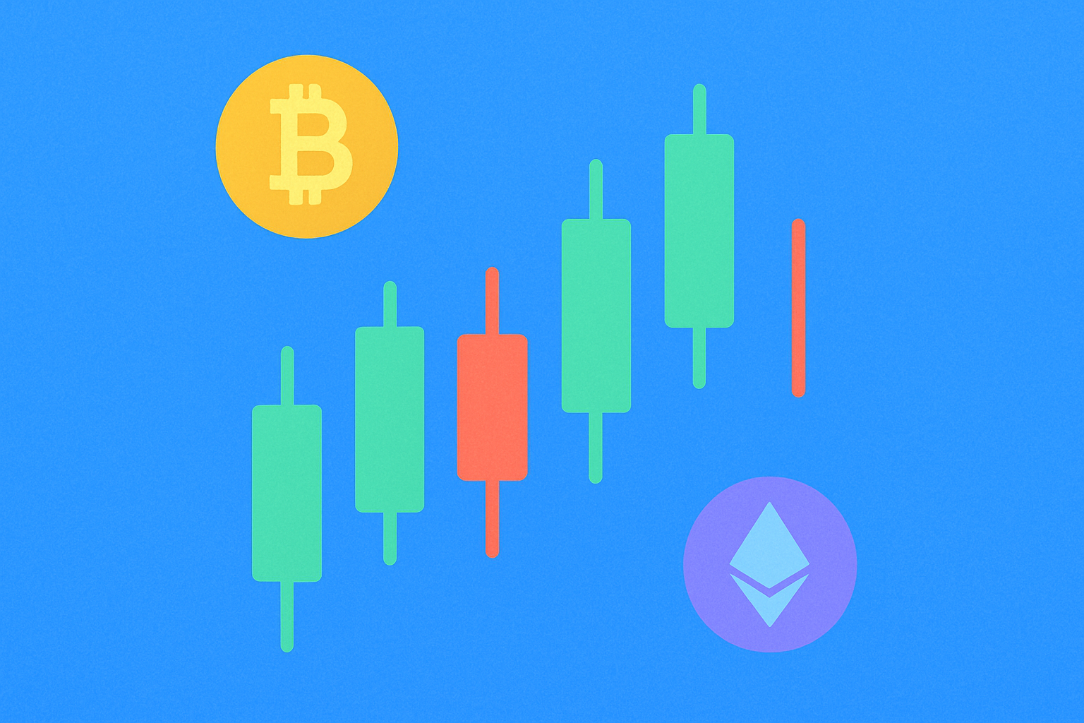
In the context of cryptocurrency trading, candlestick charts are particularly valuable due to the 24/7 nature of crypto markets and their high volatility. Understanding how to read and interpret these charts can help traders identify potential entry and exit points, recognize market trends, and make more informed trading decisions. Whether you are trading Bitcoin, Ethereum, or any other digital asset, mastering candlestick chart analysis is crucial for developing a comprehensive trading strategy.
The Four Essential Components of Candlestick Charts
Every candlestick chart consists of four fundamental components that work together to provide a complete picture of price action within a specific timeframe: Open Price, Close Price, High Price, and Low Price. Understanding these components is the first step toward mastering candlestick chart analysis.
Open Price: The open price refers to the first trading price at which a certain cryptocurrency is bought or sold within a specific time range in the market. For example, on a daily candlestick chart, the open price represents the first trade executed when the market opens for that day. This price point is crucial because it establishes the starting point for that period's price action and often reflects the market sentiment from the previous trading session.
Close Price: The close price refers to the last trading price at which a certain cryptocurrency is bought or sold within a specific time range in the market. On a daily chart, this would be the final trade of the day. The close price is often considered the most important of the four prices because it represents the final consensus of value between buyers and sellers for that period. Many traders pay special attention to closing prices when making trading decisions.
High Price: The high price refers to the highest trading price at which a certain cryptocurrency is bought or sold within a specific time range in the market. This represents the peak price level that buyers were willing to pay during that period. The high price is significant because it shows the maximum bullish momentum achieved and can indicate resistance levels where selling pressure emerged.
Low Price: The low price refers to the lowest trading price at which a certain cryptocurrency is bought or sold within a specific time range in the market. This represents the lowest point that sellers pushed the price to during that period. The low price is important because it reveals the maximum bearish pressure and can indicate support levels where buying interest emerged to prevent further decline.
These four price points combine to form the body and shadows (also called wicks) of each candlestick, creating a visual representation that allows traders to quickly assess market sentiment and price action at a glance.
Common Candlestick Shapes and Their Market Meanings
Bullish Candlestick: Signaling Buyer Dominance
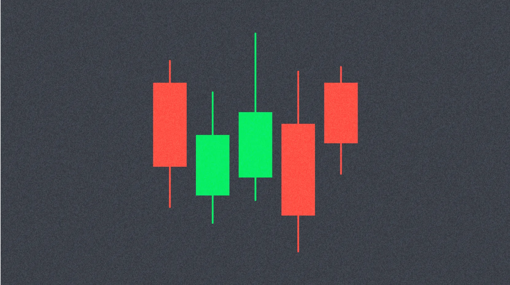
A bullish candlestick refers to a candlestick where the closing price is higher than the opening price, indicating that buyers were in control during that trading period. In cryptocurrency trading platforms, a solid green candlestick typically represents a bullish candlestick, though some platforms may use white or other colors.
A bullish candlestick indicates strong buying force, with buying volume exceeding selling volume throughout the period. The size of the candlestick body (the difference between open and close) reflects the strength of the bullish momentum. A larger body suggests more aggressive buying and stronger conviction among market participants. When multiple bullish candlesticks appear in succession, it often indicates a sustained uptrend and growing bullish sentiment in the market.
Bearish Candlestick: Indicating Seller Control
A bearish candlestick refers to a candlestick where the opening price is higher than the closing price, showing that sellers dominated the trading period. In cryptocurrency trading platforms, a solid red candlestick typically represents a bearish candlestick, though color conventions may vary across different platforms.
A bearish candlestick indicates strong selling force, with selling volume exceeding buying volume during that timeframe. Similar to bullish candlesticks, the size of the body indicates the strength of the bearish pressure. A longer bearish body suggests more aggressive selling and stronger bearish conviction. Consecutive bearish candlesticks often signal a downtrend and increasing pessimism among traders.
Bullish Candlestick with Upper and Lower Shadows: Battle Between Bulls and Bears
In a bullish candlestick with shadows, the upper shadow represents the difference between the highest price and the closing price, while the lower shadow represents the difference between the lowest price and the opening price. These shadows, also known as wicks, provide crucial information about intraday price action.
A bullish candlestick with upper and lower shadows indicates comprehensive interaction between buyers and sellers throughout the trading period. The presence of shadows shows that the price didn't move in a straight line from open to close. Buyers pushed the price higher at some point, creating the high price and upper shadow, while sellers pushed the price lower, creating the low price and lower shadow. However, the buyers ultimately triumphed over the sellers, as the closing price ended up higher than the opening price, resulting in a bullish candlestick.
The length of the shadows provides additional insight: a long lower shadow suggests that sellers tried to push prices down but buyers stepped in with strong support, while a long upper shadow indicates that buyers pushed prices higher but encountered resistance from sellers. The relative lengths of the body and shadows help traders assess the strength of the prevailing trend and potential reversal points.
Bearish Candlestick with Upper and Lower Shadows: Sellers Win the Battle
In a bearish candlestick with shadows, the upper shadow represents the difference between the highest price and the opening price, while the lower shadow represents the difference between the lowest price and the closing price. This configuration tells a story of the struggle between market participants.
A bearish candlestick with upper and lower shadows indicates comprehensive interaction between buyers and sellers during the trading period. Buyers attempted to push the price higher, creating the high price and upper shadow, demonstrating that there was buying interest at some point. Meanwhile, sellers pushed the price lower, creating the low price and lower shadow. However, the sellers prevailed over the buyers, as the opening price ended up higher than the closing price, resulting in a bearish candlestick.
The interpretation of shadows in bearish candlesticks is crucial: a long upper shadow suggests that buyers tried to rally but were overwhelmed by selling pressure, which can be a bearish signal especially if it appears after an uptrend. A long lower shadow in a bearish candlestick indicates that while the candlestick closed lower, there was significant buying support at lower levels, which might suggest the downward momentum is weakening.
Hammer Candlestick: Potential Reversal Signal
The hammer candlestick refers to a small-bodied candlestick (can be either bullish or bearish) with a lower shadow that is greater than or equal to twice the size of the body, and generally, there is no upper shadow or only a very small one. The visual appearance resembles a hammer, hence the name.
In cryptocurrency trading platforms, a red candlestick represents a bearish hammer, while a green candlestick represents a bullish hammer. However, both colors can signal a potential bullish reversal when appearing in the right context.
The larger the disparity between the size of the hammer's body and its lower shadow, the more significant its reference value and potential predictive power. Hammer candlesticks can appear as either bullish or bearish, but their interpretation depends heavily on context. The presence of a hammer candlestick often indicates a potential price reversal or bounce, particularly when it appears after a downtrend. The long lower shadow shows that sellers pushed prices significantly lower during the period, but buyers stepped in with strong force to push prices back up near the opening level, suggesting that selling pressure may be exhausting and a reversal could be imminent.
Inverted Hammer Candlestick: Early Reversal Warning
The inverted hammer candlestick refers to a candlestick with a long upper shadow and a small body (can be either bullish or bearish), and generally, there is no lower shadow or only a minimal one. As the name suggests, it looks like an upside-down hammer.
In cryptocurrency trading platforms, a red candlestick represents a bearish inverted hammer, while a green candlestick represents a bullish inverted hammer. Despite its appearance, this pattern can signal bullish reversal potential.
The inverted hammer candlestick implies a potential trend reversal from a downtrend to an uptrend, particularly when it appears after a sustained decline. It can appear either bullish or bearish, with the bullish version (green inverted hammer) indicating a more pronounced upward potential. The long upper shadow demonstrates that buyers attempted to push prices significantly higher during the period, showing that buying interest is emerging. Although sellers managed to push the price back down by the close, the fact that buyers were able to drive prices up substantially suggests that the balance of power may be shifting from sellers to buyers. This pattern is especially significant when it appears near support levels or in oversold conditions.
Doji Candlestick: Market Indecision
A doji candlestick refers to a candlestick where the closing price is equal to or very close to the opening price, resulting in little or no body on the candlestick. The candlestick appears as a thin line or cross, with shadows extending above and below.
Doji candlesticks indicate a pause or indecision in the market, representing a state of equilibrium between buyers and sellers. It suggests that there is significant disagreement between buyers and sellers, with neither side able to gain control during that trading period. The subsequent price trend after a doji is uncertain and depends on the broader market context.
The interpretation of doji candlesticks varies based on where they appear: a doji after a strong uptrend might signal that bullish momentum is weakening and a reversal could be approaching, while a doji after a downtrend might indicate that selling pressure is diminishing. The length and position of the shadows provide additional clues about market sentiment. Traders typically wait for confirmation from subsequent candlesticks before making trading decisions based on a doji pattern.
Common Candlestick Patterns and Their Trading Implications
While individual candlesticks provide valuable information, candlestick patterns—combinations of multiple candlesticks—offer even more powerful signals for predicting future price movements. There are dozens of recognized candlestick patterns, but here we will introduce four of the most common and reliable ones: Morning Star, Evening Star, Three Black Crows, and Three White Soldiers.
Morning Star: Bullish Reversal Signal
The Morning Star pattern consists of three candlesticks and is one of the most reliable bullish reversal patterns in technical analysis. The first candlestick is a bearish candlestick, indicating continued downward pressure. The second candlestick can be either a small bearish or bullish candlestick, showing indecision or a pause in the downtrend. The third candlestick is a bullish candlestick, demonstrating that buyers have regained control.
The Morning Star pattern is a powerful bullish reversal pattern that signals the end of a downtrend and the beginning of an uptrend. If this pattern appears in a downtrend, particularly near support levels, it should be noted carefully because it indicates a clear trend reversal signal and represents a very good buying opportunity. The pattern gets its name because it appears at the "dawn" of a new uptrend, much like the morning star appears before sunrise.
For the pattern to be most effective, the third bullish candlestick should close well into the body of the first bearish candlestick, ideally above its midpoint. The larger the third candlestick and the higher it closes, the stronger the reversal signal. Traders often look for confirmation through increased volume on the third candlestick, which validates the strength of the buying pressure.
Evening Star: Bearish Reversal Warning
The Evening Star pattern generally appears at the end of an uptrend and serves as a warning that the bullish momentum is exhausting. It consists of three candlesticks that mirror the Morning Star pattern. The first candlestick is a large or medium-sized bullish candlestick, showing continued upward momentum. This is followed by a small bullish or bearish candlestick, indicating indecision as the trend loses steam. The third candlestick is a large or medium-sized bearish candlestick, confirming that sellers have taken control.
The closing price of the third candlestick must penetrate below the middle of the first bullish candlestick for the pattern to be valid. The Evening Star pattern symbolizes that the price has reached its peak, and the market is likely to enter a bearish downtrend. The pattern is named after the evening star that appears at dusk, signaling the end of the day, just as this pattern signals the end of an uptrend.
The reliability of the Evening Star pattern increases when it appears near resistance levels or in overbought conditions. Traders should pay attention to the volume profile: ideally, the third bearish candlestick should show increased volume, confirming strong selling pressure. The deeper the third candlestick penetrates into the first candlestick's body, the stronger the bearish reversal signal.
Three Black Crows: Strong Bearish Continuation
In traditional financial markets, three red candlesticks might represent different patterns, but in the cryptocurrency field where red candlesticks represent bearish price action, Three Black Crows are considered a strong bearish pattern. This pattern consists of three consecutive falling red candlesticks, where each candlestick opens within the body of the previous candlestick and closes at or near its low.
The closing price or low price of each candlestick is lower than the previous one, demonstrating sustained selling pressure and bearish momentum. When Three Black Crows appear, particularly after an uptrend or at resistance levels, there is a high probability of a continued downtrend. This pattern indicates that sellers are in firm control and that each attempt by buyers to push prices higher is met with aggressive selling.
The pattern is most powerful when the three candlesticks have relatively long bodies with little or no upper shadows, showing that sellers maintained control throughout each trading period. Traders should be cautious about taking long positions when this pattern appears and may consider it as a signal to exit existing long positions or enter short positions. The pattern's reliability increases when accompanied by high trading volume, particularly on the third candlestick.
Three White Soldiers: Strong Bullish Continuation
In traditional financial markets, the interpretation of colored candlesticks may vary, but in the cryptocurrency field where green candlesticks represent bullish price action, Three White Soldiers are considered a powerful bullish pattern. This pattern consists of three consecutive rising green candlesticks, where each candlestick opens within the body of the previous candlestick and closes near its high.
This is a very common and reliable candlestick pattern in cryptocurrency trading. When Three White Soldiers appear, particularly after a downtrend or at support levels, there is a higher likelihood of a sustained bullish trend ahead. The pattern demonstrates that buyers are in control and that each candlestick builds upon the gains of the previous one, showing strong and consistent buying pressure.
For the pattern to be most effective, the three candlesticks should have relatively long bodies with small or no lower shadows, indicating that buyers maintained control throughout each period with minimal selling pressure. The pattern is especially significant when it appears with increasing volume across the three candlesticks, confirming growing buying interest. Traders often view this pattern as a strong buy signal and may use it to enter long positions or add to existing positions. However, as with all technical patterns, it's important to consider the broader market context and use additional confirmation indicators before making trading decisions.
Practical Application and Risk Management
While candlestick charts and patterns provide valuable insights into market sentiment and potential price movements, they should not be used in isolation. Successful traders combine candlestick analysis with other technical indicators, volume analysis, and fundamental analysis to make well-informed trading decisions. Additionally, proper risk management, including the use of stop-loss orders and position sizing, is essential when trading based on candlestick patterns. Remember that no pattern is 100% reliable, and market conditions can change rapidly, especially in the volatile cryptocurrency markets.
FAQ
What is a K-Line Chart? What is its role in trading?
A K-Line Chart is a technical analysis tool displaying price movements within a specific timeframe. It helps traders identify trends, reversals, and support/resistance levels, enabling data-driven trading decisions and market trend analysis.
What do the four basic elements of candlesticks (open price, close price, high price, low price) represent?
Open price is the starting price when trading begins. Close price is the ending price when trading closes. High price is the highest price during the period. Low price is the lowest price during the period.
How to distinguish between bullish and bearish candlesticks? What do they represent?
Bullish candlesticks (empty bodies) indicate price increases, with closing price above opening price. Bearish candlesticks (filled bodies) indicate price decreases, with closing price below opening price. They reflect market sentiment and trading activity.
What are common candlestick patterns? How to judge market trends through candlestick patterns?
Common patterns include doji, hammer, and spinning top. Doji signals indecision, hammer suggests reversal upward, spinning top indicates strong volatility. Combining these patterns with volume analysis helps predict market direction and trend changes effectively.
What are the differences between different K-line time periods (daily, weekly, monthly, etc.)?
Different time periods reflect price movements over varying durations. Daily lines show short-term volatility with high sensitivity, while weekly and monthly lines display broader trends with lower sensitivity. Shorter periods suit short-term trading; longer periods suit long-term investment analysis.
How should beginners learn to read and analyze K-line charts?
Beginners should first understand the four key prices: open, close, high, and low. Learn to identify candle patterns like long bodies and shadows to recognize trends. Practice analyzing trading volume and price movements to interpret market sentiment and potential reversals.
* The information is not intended to be and does not constitute financial advice or any other recommendation of any sort offered or endorsed by Gate.