Futures
Access hundreds of perpetual contracts
TradFi
Gold
One platform for global traditional assets
Options
Hot
Trade European-style vanilla options
Unified Account
Maximize your capital efficiency
Demo Trading
Introduction to Futures Trading
Learn the basics of futures trading
Futures Events
Join events to earn rewards
Demo Trading
Use virtual funds to practice risk-free trading
Launch
CandyDrop
Collect candies to earn airdrops
Launchpool
Quick staking, earn potential new tokens
HODLer Airdrop
Hold GT and get massive airdrops for free
Pre-IPOs
Unlock full access to global stock IPOs
Alpha Points
Trade on-chain assets and earn airdrops
Futures Points
Earn futures points and claim airdrop rewards
The Clever Use of MACD on the Weekly Chart
Brothers, today I found a very interesting move. The MACD’s golden cross and death cross on the weekly chart can help judge the daily chart’s top and bottom.
How do you use it? Let’s take an example: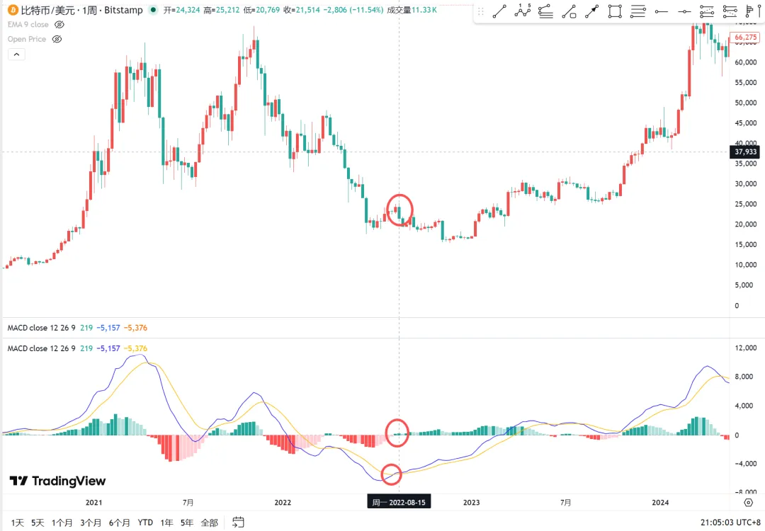
1: Below the zero line, if MACD forms a golden cross—does that mean it’s going up? Wrong.
2: The second energy bar.
3: On the daily chart, it’s a top.
This method can be used to judge signals that a rebound has ended. How effective is it? There are ready-made ones: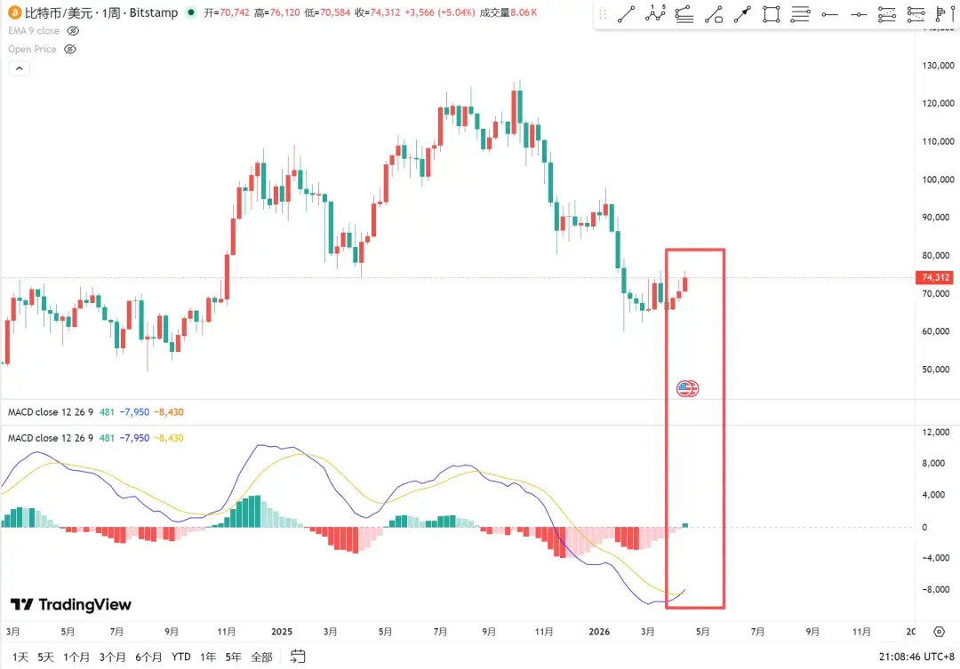
Right now, the big biscuit is rebounding. MACD below the zero line has already formed a golden cross. This week is the first energy bar. If the judgment method above is correct, then the big biscuit should drop next week.
This method has 2 uses: 1: A signal that the rebound has ended—telling you not to keep holding the long idea. 2: Start thinking about waiting for opportunities to short.
Because these are weekly-chart signals, most actions are on the daily chart. So breakouts on the daily chart can’t be acted on directly; it’s best to wait for a fake breakout, or a break below the neckline, and so on. In short, be ready for a reversal at all times.
On the flip side, a MACD death cross above the zero line is a bottom.
Weekly chart of gold.
1: MACD death cross above the zero line.
2: The second volume/energy bar.
3: The daily chart shows a bottom.
If you know this method, at least you know that at that time, you shouldn’t cut losses on paper gold. Instead, it’s a chance to go long.
So is this method 100% correct? My intuition says it’s not. At the very least, in a choppy/sideways market, the success rate might be very poor, because MACD itself isn’t a range-bound indicator—so it can’t be used in a ranging market. When judging a bottom, it’s best to see continuous big drops and panic, to identify an oversold rebound. Or use it to judge when adjustments end during a trend continuation. For reversals, it probably can’t be used.
Use this method to apply it to A-shares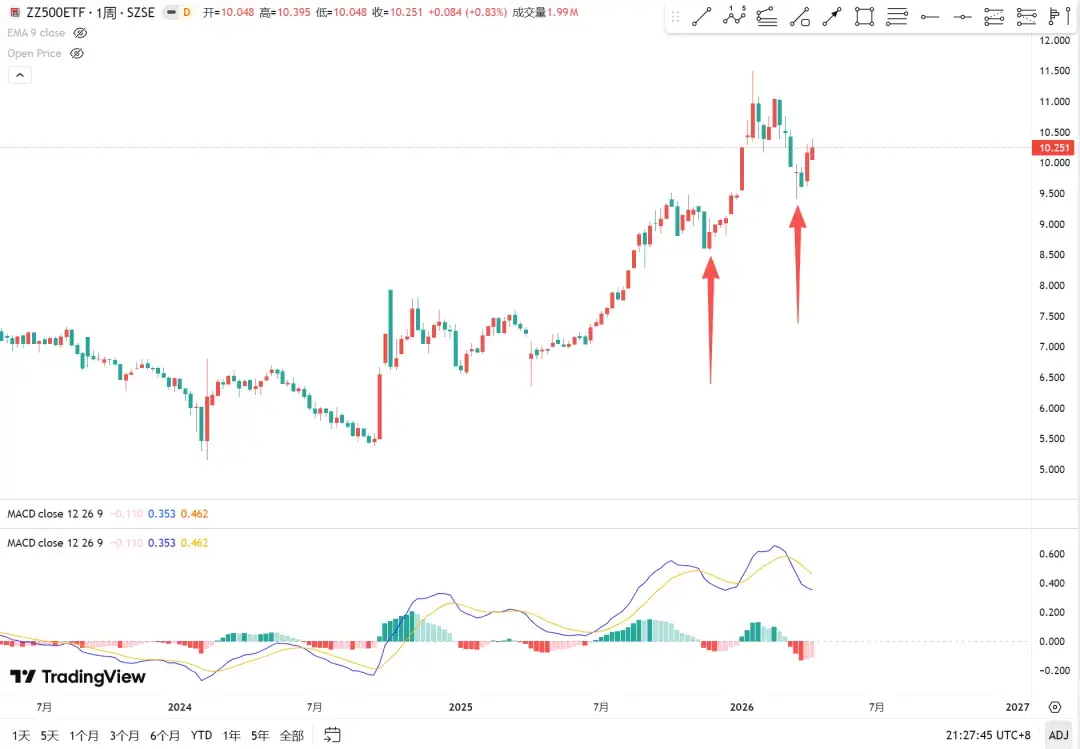
A chart of the CSI 500 weekly trend line: the last two times were both correct. Both times were: a MACD death cross above the zero line, the second bar, and the daily chart showed the bottom.
Note the period to use: use the MACD on the weekly chart to judge the daily chart’s top and bottom. Can the daily + 4H chart be used? You guys research that yourselves.